
Gallery#
Required data#
Download the SIM2 and EXPLORE2 datasets#
Hint
more details to come
Figures#
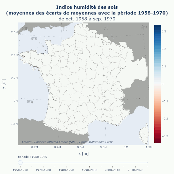
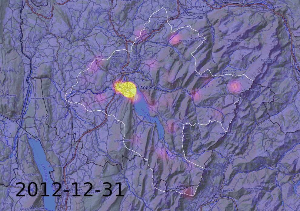
Maps (historic reanalysis data SIM2)#
These interactive maps make it possible to explore the past climate trend period by period (using the cursor), while observing how the national scale articulates with the local scale (by zooming in). Many visualization modes are detailled below:
absolute values (annual, seasonal or by semester)
seasonal or by-semester values expressed as a percentage of annual values
values as a percentage of precipitations
values as difference to precipitations
deviation from reference period (1958-1970), and
deviations as percentages.
SWI decennal mean evolution#
Data are from MeteoFrance historical reanalysis (SIM2).
Hint
in progress…
Seasonality curves#
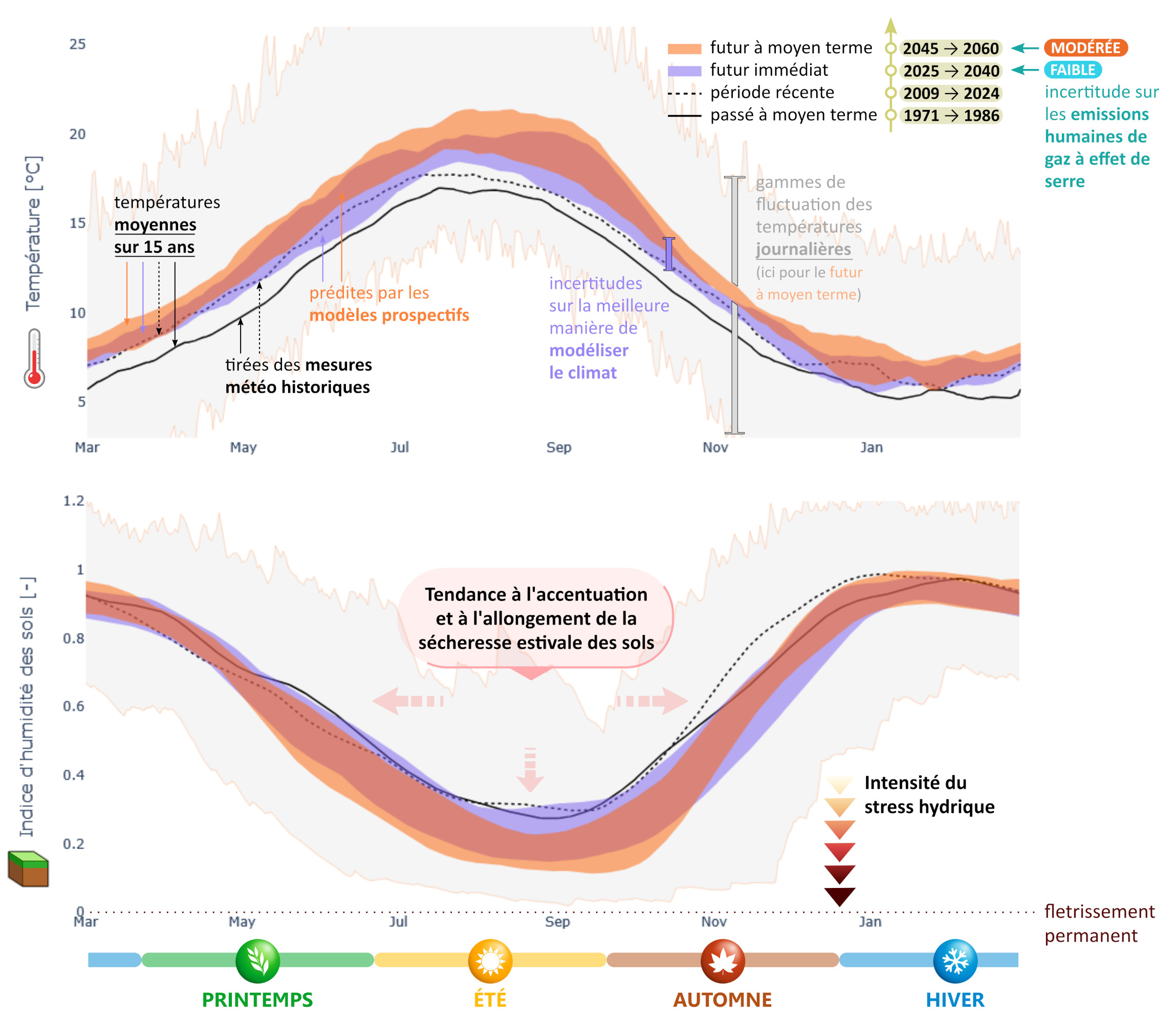
Saisonnalité des températures et de l’indice d’humidité des sols (« SWI ») sur Lorient Agglomération.#
Ces moyennes sur 15 ans montrent le climat « normal » sur chaque période et son évolution sous l’effet du changement climatique. Les variations naturelles inter-annuelles, intrinsèques à la météo et au climat, sont illustrées par l’ombre grise . L’épaisseur des bandes orange et violette rend compte des « incertitudes de modélisation » liées à l’imperfection des modèles. Aux variabilités mentionnées s’ajoute enfin l’incertitude due aux choix d’aménagements du territoire et d’usages de l’eau. Les projections futures correspondent au scénario de teneur en gaz à effet de serre « RCP 8.5 », qui a été le plus à même de décrire notre trajectoire récente et qui, au vu des engagements actuels des états, continuera vraisemblablement de décrire avec pertinence les 25 prochaines années. Par soucis de lisibilité, les courbes sont moyennées sur 30 jours, sauf pour l’ombre grise.
This type of figure is designed to show at a glance climate seasonality and its past and future evolutions. Compared to more classical representations of seasonal values, this type of figure in the form of an annual continuous timeseries highlights the relationships between seasons. Is it warmer in May because summer comes earlier? Or because summer cover a longer period? Or because the seasons are more contrasted? Or because the temperature has risen in every season? Considerations of this kind can be grasped here at first glance.
This figure can be obtained with the following commands in the IDE:
from geop4th import trajplot as tjp

F = tjp.Figure(
    var = 'T', # temperature
    root_folder = "myDataPath",
    scenario = 'rcp8.5',
    coords = r"myMasks/myStudyArea.shp",
    )

F.plot(
    plot_type = 'temporality_mean',               # 365-day curves
    period_years = [(2025, 2040), (2045, 2060)],  # plot averages for specific periods
    rolling_days = 30,                            # additional smoothing step
    annuality = 3,                                # x-axis starts from March
    )

F.layout(
    filename = 'myAreaName.html', # or '.png' or '.svg'...
    language = 'en',
    plotsize = 'paper',
    color = 'discrete',  # predefined colormap
    shadow = 'last',     # for the last plotted period, the daily envelopp will be plotted
    )
Other example:
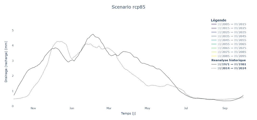
Percolation at the bottom of the soil (SIM2)#
Illustration of the predicted evolution of the variable DRAINC (~recharge ~baseflow) from the EXPLORE2-SIM2 dataset, under a RCP 8.5 scenario, over the catchments of Nive and Nivelle (Pays Basque).
Obtained as follow:
from geop4th import trajplot as tjp

F = tjp.Figure(
    var = 'DRAINC', # ~recharge ~baseflow
    root_folder = "myDataPath",
    scenario = 'rcp8.5',
    coords = r"myMasks/Nive-Nivelle.shp",
        name = 'Nive-Nivelle',
    )

F.plot(
    plot_type = 'temporality', # 365-day curves
    period_years = 10,         # plot 10-year averages
    rolling_days = 30,         # additional smoothing step
    annuality = 10,                # x-axis starts from October
    )
Metrics plots#
From the same data loading of the previous figure, it is possible to derive other types of figures.
F.plot(
        plot_type = '>30',           # number of days over 30°C
        # no need to repeat the previous arguments:
        # period_years = 15,         # plot 15-year averages
        # rolling_days = 60,         # additional smoothing step
        # annuality = 10,            # x-axis starts from October
        )

# One wide version:
F.export(
        name = 'myAreaName',
        language = 'en',
        plotsize = 'wide',
        )
# One smaller version:
F.export(
        name = 'myAreaName',
        language = 'en',
        plotsize = 'paper',
        )
Illustrations of data retrieved with download scripts#
Water withdrawals data#
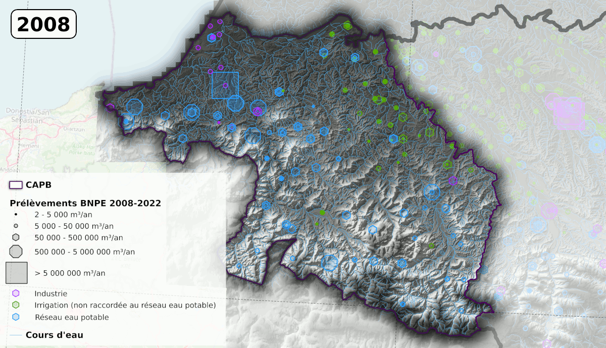
Water withdrawals data#
These data can be retrieved using the following commands:
# Imports
from geop4th import (
        geobricks as geo,
    download_fr as dl,
    standardize_fr as stz,
)

# Download BNPE data
dl.bnpe(dst_folder = r"<destination_folder>",
        masks = r"path/to/my/mask",
                    # departements = [73, 74],
        # start_year = 2008,
        # end_year = 2023,
        # filetype = ['csv', 'geojson'],
        )

# Combine, merge and clip vector data
ds = stz.bnpe(r"<destination_folder>\originaux")
    geo.export(ds, r"<destination_folder>\standard.json")